Tate Website

Description
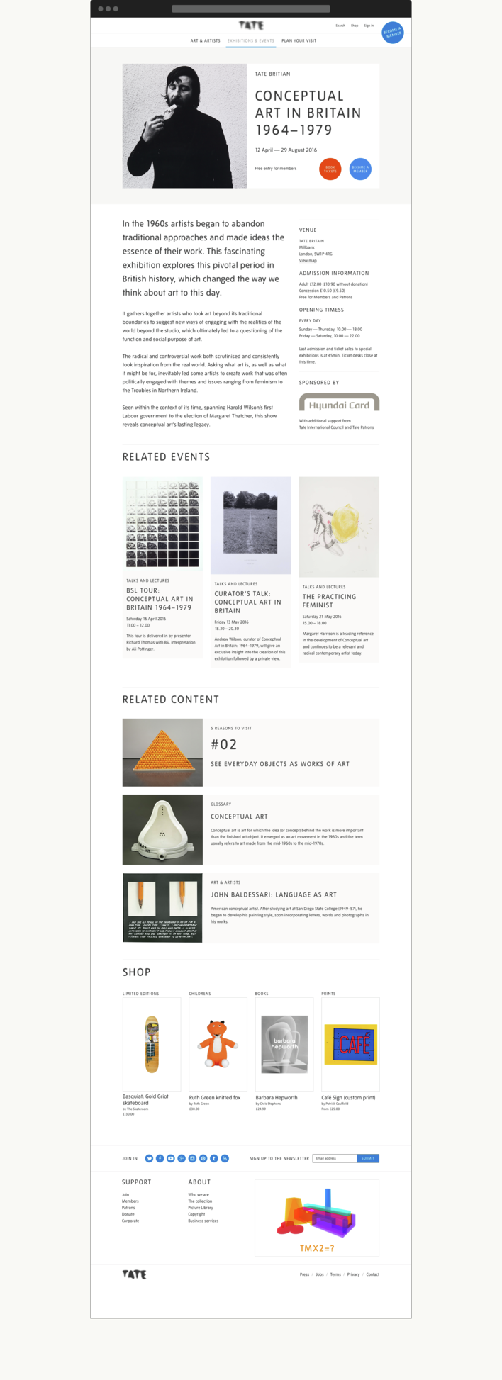
Fitzroy & Finn were delighted to be invited to design the new Tate website. The key aim was to refresh Tate’s online experience to give a more visually engaging offering that conveys, reflects and aligns to the new Tate brand experience, and addressing issues around Visit Experience and content discovery. We worked closely with the wonderful in-house Tate Digital team to design the Homepage, Visit Experience (Visit, What’s on Listing, Exhibition, Event, Display) and new Navigation.
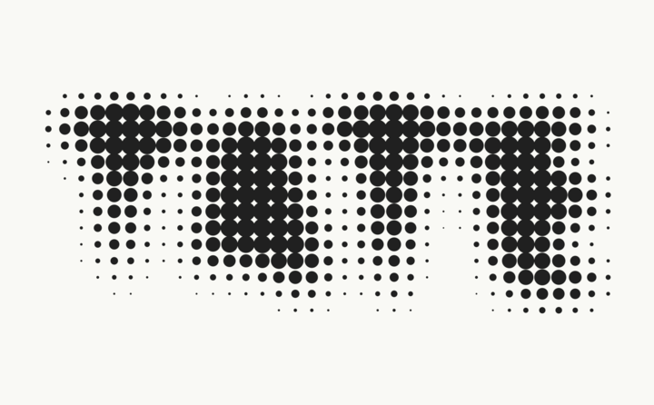
The fantastic design agency North have been working on the rationalisation and consolidation of the Tate brand, so we were lucky to be translating the great designs and typographic treatments they established for the exhibition campaigns, Tate Guide and marketing materia into a digital context. Cartledge Levine have been working with Tate on the wayfinding and signage for Tate Modern 2 so it was really exciting working with them too.
It has been a great project to have worked on and we are really pleased with the outcome!
Category
HOMEPAGE

EXHIBITION PAGE

VENUE PAGE

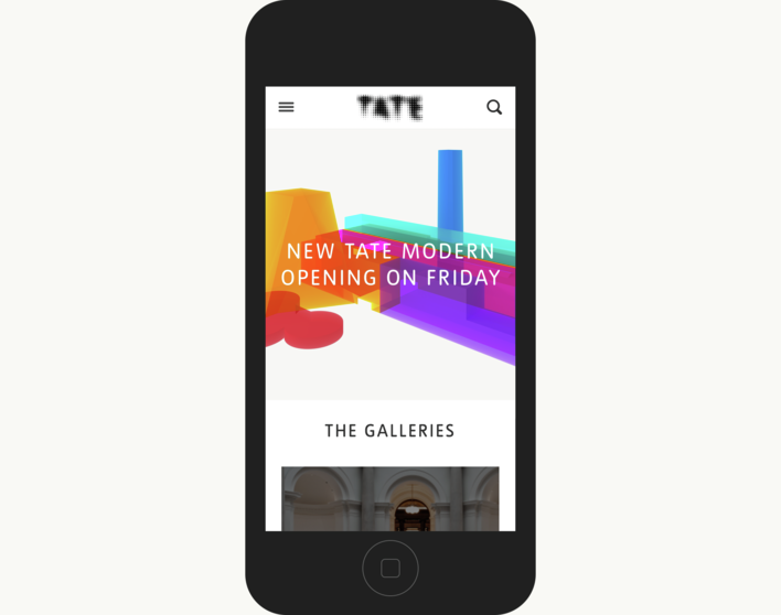
HOMEPAGE ON MOBILE

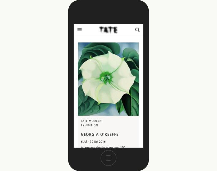
EXHIBITION PROMO ON MOBILE
