We Can Teach Design Better.
We Can Teach Design Better.
Paul was delighted to be interviewed by Ulrik Hogrebe, Creative Director at Frog Design, New York and former Creative Director at BBC News & World Service for the wonderful Type Thursdays interview series on Medium, published in December 2017. Here it is:
Paul Finn is the Platform Leader in Information & Systems on the BA (Hons) Graphic Communication Design and teaches graphic design and typography to both students and professionals. We talk to him about owning one’s learning, practical exercises to enhance your understanding of typography and the role of graphic design education in society today.
Date
- 23.01.18
Category
THE INTERVIEW
Ulrik Hogrebe: Hi Paul — super happy that we get a chance to catch up.
Paul, you teach at Central St. Martins, tutor designers at the BBC in typography and on top of that, manage to have your own practice as well. And of course, you were my tutor when I was at BBC News back in the day.
Your teaching was really instrumental to me, so think I’d like to talk about your approach and your philosophy in terms of teaching. But before we get ahead of ourselves, why don’t you talk a bit about yourself and your interest in type?
Paul Finn: Hello! And thank you for inviting me to this and your kind words! I have always had an interest in type, from drawing lettering as a child / teenager. I was in bands so would design the band logo and I was into skateboarding and loved the visual language around skateboards. Everything; logos / graphics / fashion — H Street, Deathbox, Independent, New Deal etc, and the magazines. I think a lot of what those designers did was to really exemplify the idea of type being image and letters being form.
In college the Designers Republic were my all time heroes. I studied Graphic Arts & Design at Leeds Metropolitan University from 1997–2000. The Designers Republic were not far away in Sheffield and they designed some great flyers and posters that you’d see around Leeds — so a huge inspiration for us as students. We went to Rotterdam and Amsterdam in our first year and I saw some amazing Dutch graphic design; from 75B to Walter Nikkels and Ootje Oxenaar. And we also stumbled on MAMA in Rotterdam… that blew me away. I bought a great book which I still love called ‘Typography: When Who How’ by Friedrich Friedl, Nicolaus Ott and Bernard Stein. In the second year we went to New York, and I bought another great book ‘Josef Muller-Brockmann Pioneer of Swiss Graphic Design’ by Lars Muller and began to understand who influenced The Designers Republic.
Ulrik: Yes, I always loved Jim Phillips and his work for Santa Cruz. The ‘Screaming Hand’ logo is iconic and was probably one of the things that attracted me to design—although I had no idea that you could do that for a living at the time.
So what about today? How do you spend your time today?
Paul: Ha! Sorry that was a bit of an indulgent trip down memory lane! Well I run my own little design company called Fitzroy & Finn. Fitzroy is a mountain in Patagonia, Argentina that my wife and I walked up — and it was when I was up there that I had a bit of an epiphany and realized that I wanted to teach and set up my own studio. I had worked at the BBC from 2001–2005 designing the websites for BBC Radio 3, Radio 1, Radio 5 Live, Radio 4. It was great but I was beginning to get a little restless.
I really enjoyed my art education so wanted to return to it, but on the other side — it also balances my Fitzroy & Finn work, in the sense that both feed into each other. I ended up teaching on the Foundation course at Central Saint Martins for 7 years, which is often where people discover graphic design / typography for the first time. So it’s really a exciting course to teach. Lots of good energy and rawness, which is so inspiring to be around.
Two years ago I moved to teaching on the BA Graphic Communication Design at CSM, leading the new Information & Systems platform — it is super exciting as I am writing the curriculum for a newly revalidated course: writing project briefs, running workshops and teaching with some great colleagues. Phil Baines is the professor of typography and I am currently running typography workshops with him which is amazing (he wrote a good book called ‘Type and Typography’ with Andrew Haslam).
Ulrik: I have always enjoyed your teaching style, as it always felt to me that you took a less traditional approach to teaching. Let’s talk about your philosophy to teaching.
A New Structure for Education
Paul: Well, I think that the old guru style of teaching is outmoded — I like to think that students are future colleagues (I think that Norman Potter author of ‘What is a Designer’ said something along those lines). I like to play music in the studio, get people standing up, occasionally when the need arises getting rid of the tables, standing in circles and what not! I sound like a hippy — but I am of the opinion that when you are comfortable, you are confident and that makes it easier to do what you’ve got to do.
I also believe that students need to take ownership and authorship of their own learning. This lets them take charge and discover and expand and ‘become’ — it may sound a little idealized but there you go!
Ulrik: No I’ve seen it work. One of the things you did with me was to have me sketch out my own curriculum — what I wanted to learn — and then help me fill in the gaps and achieve that. I think you might have said the words ‘self-directed’ learning at some point?
Paul: When I did my teachers qualification I got into Action Research Methodology — which essentially is when you identify a challenge in your practise and challenge it! The designer Karl Gerstner in his Designing Programmes states: “to describe a problem is part of the solution”. The idea is you identify the areas that you need to explore for yourself. Again it means ownership.
And that is it: you can show students things to get them excited or hooked, but equally they have got to get involved, to take control of their own learning and engage properly in the subject. We need to be constantly looking / questioning / noticing and critically engaging with the world and the crazy amount of information that we consume each and every day.
UH: So what does that look like in practice for the students? You made me sketch out what I wanted to explore and then keep a journal and a blog documenting my explorations. Is it the same methodology with them? What kind of tools and processes do you give them?
PF: Students keep sketchbooks. These evidence, support, situate and validate their idea development — and at the same time records and documents their experimentations and research. They provide analysis, reflection and evaluation.
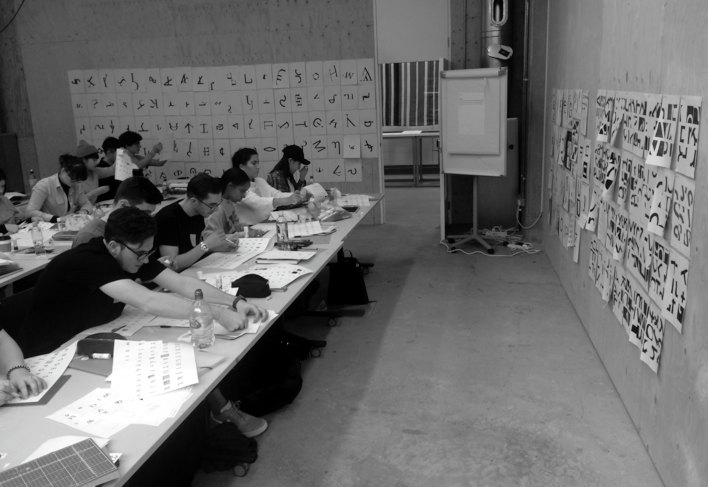
At CSM, I have been running two simultaneous projects with my group — one on a Tuesday and one on a Friday, over a period of 5 weeks. The Friday project is typography focused: the first 3 weeks is made up of a series practical workshops — no computers — students are using paper / cutting / sticking / physically engaging and interrogating letterforms.
The workshops are tightly structured and each week they have follow up exercises that expand and develops on from the workshop. The idea is that over the course of the project we zoom out the letter to the word to the line to the text.
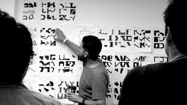
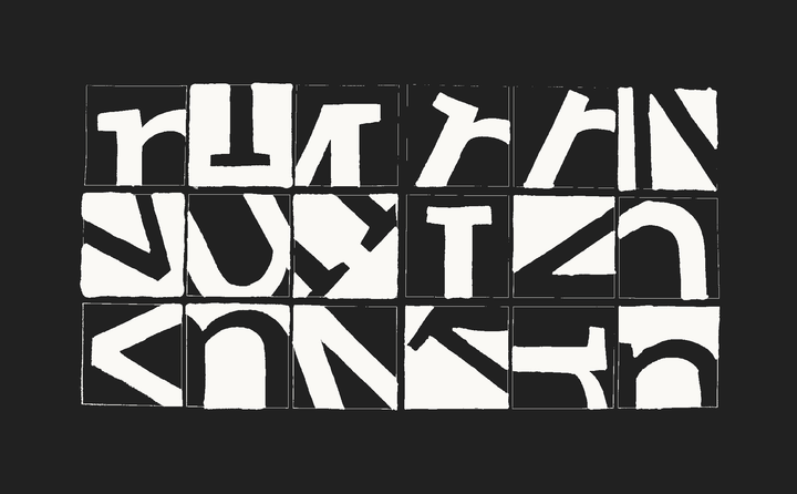
The exercises have been pinched from various sources! from Emil Ruder’s Typography to Ellen Lupton’s Thinking with Type to John Kane’s A Type Primer. One of my favorite tasks is from Willi Kunz’s Typography: Formation and TransFormation: each student is given a letter (upper and lowercase) in a sans serif and serif typeface, the instruction is simple: create new signs by cutting and shifting, you can cut and shift only once. It generates lots of amazing glyphs / signs / symbols…
The Tuesday project is more open. Essentially, a student begins with any object that can fit into a 5cm box — they then explode that object into pure information; exploring the material, shape, value, function, purpose, social, economic meaning which they respond to. Thereby they become content producers / curators / critiquers and situate their object within a complex array of networks / associations / industries and markets. This is to represent and instill a shift in the role of the graphic designer; from conveyer of information to creator, content producer, author and publisher—building on Michael Rock’s ‘The designer as author’ and Ellen Lupton’s ‘The Designer as Producer’ seminal essays.
UH: Another thing I enjoyed is your emphasis on the art and process of exploration. I see a lot of design education today that misses this part. Students are set a brief; “Create a visual identity for such and such” or a UI for this thing here — and they come back with good quality but un-original work and are then critiqued on their technical execution. I often lack them being able to talk fluently about influence and process. Their exploration stops at aesthetics and not at the broader cultural sphere of what they are designing.
Design’s Role in Society
PF: You have hit the nail on the head! That is the question: what is art education for? To teach them the Adobe CC suite so that they can create polished / professional design? Or to explore with them different ways of thinking, seeing and critically engaging within the world. It is tricky as here in England education is expensive — what is the return on investment? I don’t know — it is good for students to be switched on, engaged, committed, curious, but equally they have got be be employable. Or able to transition into the industry.
UH: Yes but I think we toe a dangerous line if we start to believe that an art education should strictly conform to economic logic. Yes, designers need to be employable, but their worth can’t be measured in “pixels produced”. It must be measured in the broader sense of it’s contribution to society—and that has to acknowledge the graphic arts as cultural work, as a shaper of meaning at both the micro and the macro scale. And so we have to teach students the tools and the responsibility of cultural discourse, not just how to find the rectangle tool in Sketch or Illustrator.
PF: Graphic design is a political, social, cultural act / gesture. It gets complicated quickly. The work of Metahaven is fascinating as they engage with the political act of design — can anything really be otherwise? We exist within an economic framework, so we have to adhere to it to survive, but equally should/could it be challenged from a design perspective?
Design thinking can be applied to anything; how we think around the problem, or what’s the problem behind the problem? But from a student’s point of view, they want to engage in the industry and profession—so how do we best equip them with the skills to do so.
There is a lot of thorny issues around interning and what that exchange involves: unpaid internships equate to experience, but that intern is contributing to something that generates income. A colleague of mine introduced me to a great book recently called ‘Training for Exploitation? Politicising Employability and Reclaiming Education’ by Precarious Workers Brigade which explores exactly this question — well worth the read.
UH: Yes, I think it’s useful to equip them and to point them in the direction of industry, yet at the same time also emphasize that ‘knowledge of illustrator’ is not the only thing that they bring to the table in a professional context. Sometimes I sense a reticence from designers to take that kind of ownership.
Paul, we are heading towards the end here. I spoke to Karen Cheng who wrote ‘Designing Type’ a while back and we netted out agreeing that there should be more exchange of ideas between people who teach typography and type. So in that spirit, do you have any advice for other teachers out there?
PF: Sorry to have rambled on! It has been nice to discuss these topics with you, it feels like the beginning of a longer conversation. In terms of advice, I think by sharing, exchanging and discussing ideas / experiences of teaching with colleagues, friends and family we help to clarify, understand and ultimately improve on what we do. Teaching is continuous learning!
Typography workshop with Stage 02 students at CSM
Student work: Interrogating letterforms

Cut-up exercise using the letter G / g by student Lara Coromina.
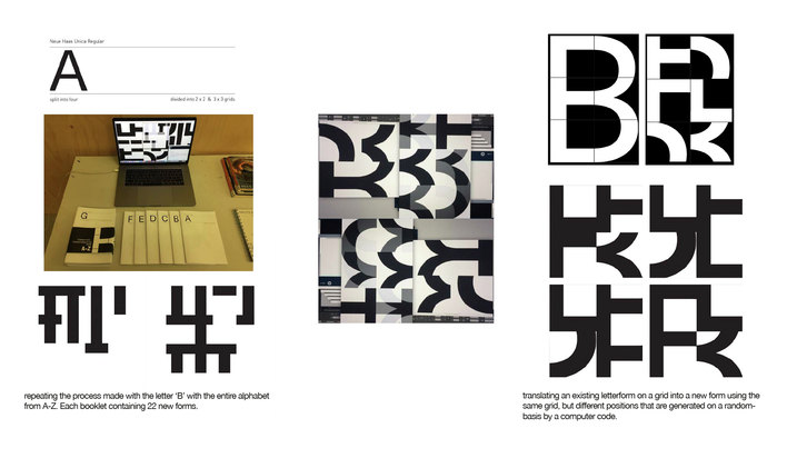
Code experiments to deconstruct letterforms based on grid by student Sapir Ziv.
Student work: Interrogating an object
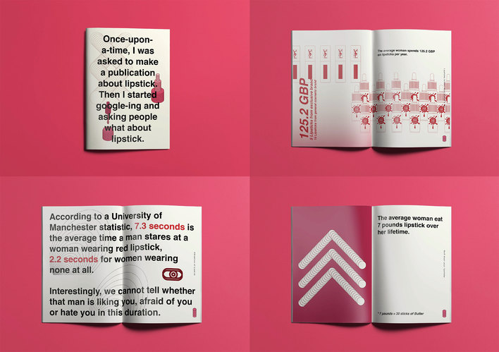
Publication exploring lipstick as an object by student Tsz Ling Lo.

Interrogating an object; a sales receipt — research by student Lara Coromina.
Paul teaching a workshop
