Letterform
Letterform

The future was bold in 1927 as Paul Renner typographically manifested Modernity. Reduced to geometric perfection his timeless Futura gave form to the principles of the modern movement. A universal sans serif which transcended time and space, bringing to fruition the earlier typographic experiments of Bayer and Tschichold.
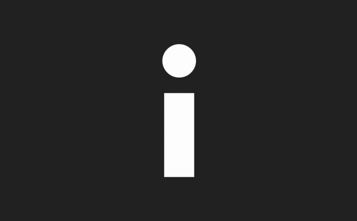
I align to Futura Bold’s lower case ‘i’ whose form is attained by a near perfect circle suspended harmoniously above its opposite geometric form — an elongated square. The only letterform to be formed by these binary opposites — the dot and the line, suitably illustrating Paul Klee’s maxim that “a dot is a line that went for a walk…”
Not only a letterform ‘I’ is a word: a pronoun, the first person singular — used by a speaker to refer to himself or herself, and also a noun — the I — in metaphysics it is the subject or object of self-consciousness; the ego. The lower case ‘i’ seems more of a fitting form of the self, in comparison to it’s sibling the consolidated capital ‘I’. i is now re-framed as an icon of the self; a head and a body. A symbol of the human figure, standing solid and proud.
i also admire i for its versatility of form and meaning: rotate i 90° it transforms to become — ∙ the Morse code for the letter ‘n’, rotated 180° it transmorphs to exclaim the glyph !, rotated 270° it translates to ∙ — the Morse code for the letter ‘a’.
i — ∙ ∙ — !
Reduced to further abstraction i see i re-framed as Edward Munch depicted the moon’s reflection in the sea in his 1895 painting ‘Moonlight’, in which the moon’s reflection forms a vertical line. The space between the dot and the line now infers the horizon, a place of translation from a dot to a line…
Published in Grafik, March 2014. Part of 'Letterform'
Date
- 20.03.14