Transport For London
Description
Transport For London is an iconic brand and service synonymous with London. It was a great honour to be invited to work with the wonderful TfL Experience Studio team in defining the Visual Design Language, which creates a consistent user experience across their extensive digital services, from websites to apps to in-station information screens.
There has been a recent collapse in the distinction between physical and digital expressions of brands: for example; you could be on a TfL App whilst at a TfL tube station, or browsing the TfL website whilst on the bus home. The visual language therefore needs be aligned and consistent, the typography, use of colour, tone of voice and design aesthetic should be unified across all the various touch points.
This position framed the project, looking at how the existing design paradigms of in-station signage and commuter/user flows can translate into digital contexts and services. It was a great exercise in research and exploration. TfL Experience Studios have embedded Service Design methodologies into their design process so it was exciting for us to work with new ways of viewing and framing user experiences and consequently the design approach.
Another highlight of the project was using the newly released Johnston100 typeface, designed by Monotype, in celebration of 100 years of Edward Johnston’s truly wonderful typeface. It is a versatile typeface with various weights from a hairline to a medium, it was a pleasure to use, as was using the iconic roundel, Underground map & colour palette.
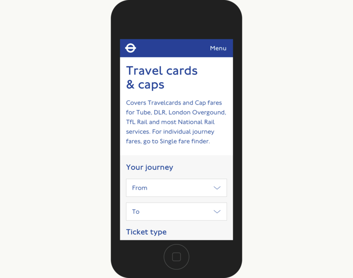
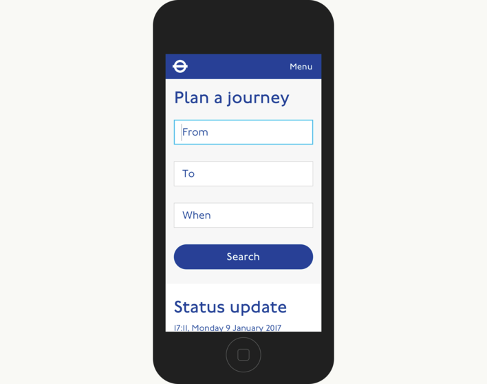
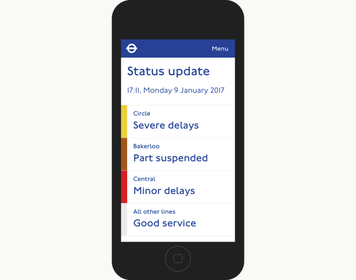
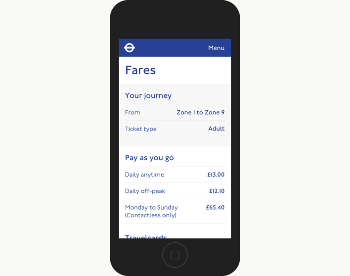
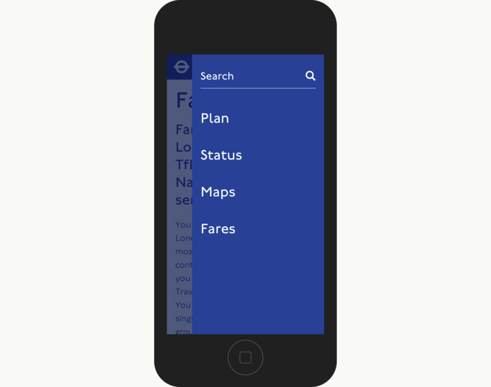
Below are some concepts designs exploring the mobile application of the brand.
Plan your journey
Status Update
Fares
Menu
Travel Cards
