Transport For London Icons
Description
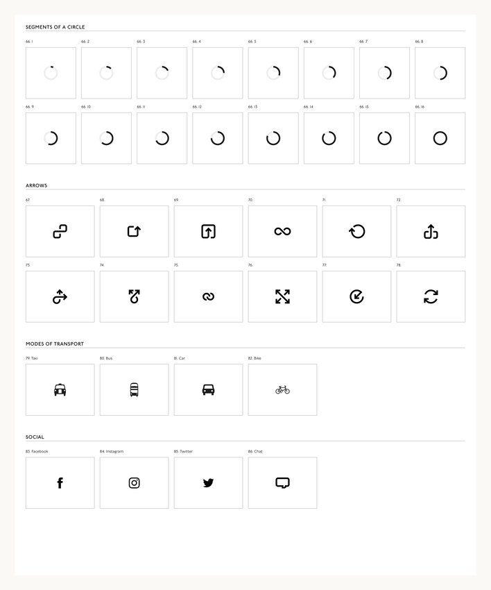
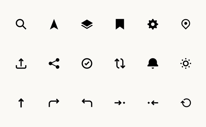
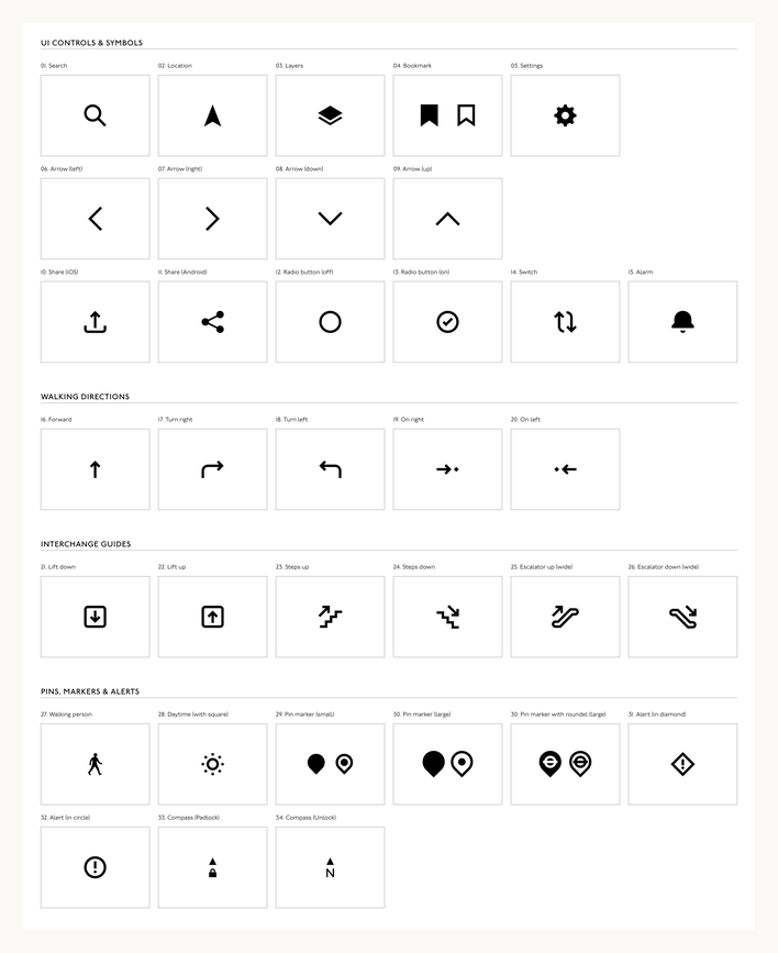
We had worked with TfL Digital Studio on the TfL Visual Design Language and were very happy to return to develope a new suit of icons for their digital platforms; from the website, to apps to in-station screens.
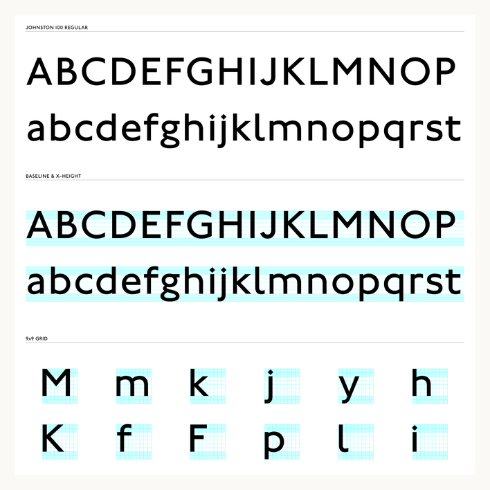
Johnston 100 is the newly commissioned typeface by Monotype, the ambition was to create a consistent iconography that aligned to the proportions and weight of Johnston 100. The key to the project was the diamond dot of the ‘i’, the tittle. It is a diamond shape that represents / reflect the nib of a calligraphic pen.
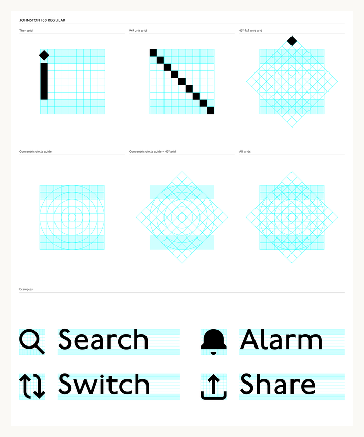
Edward Johnston was a calligrapher, and based the proportions of Johnston on the calligraphic hand, so the dot of the ‘i’ in essence is the basic unit of the whole typeface. Rotate the diamond 45° and duplicate 9 times results in 9x9 grid that notionally every letterform exists within, 2 units for ascenders and 2 units for descends. So this 9x9 grid structure gave us the proportions and structure that we used to create all of the icons.
It was a fascinating project as we reacquainted ourselves with the wonderful world of semiotics, read lots of great books especially Per Mollerup’s seminal Wayshowing and Pictograms Icons and Signs by Rayan Abdullah & Roger Hübner, and got to work with the great and talented TfL Digital Studio design team.
Category
Johnston 100
The grid
UI Controls & Symbols
Core UI
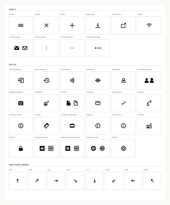
Arrow & Modes of Transport
